One Design, Three Screens
The thing that stops a personal project from looking like a personal project is discipline: a small kit of parts, used the same way everywhere. This is the story of the “Mk” design system behind our home app — how a phone, a wall tablet, and a kids’ mode ended up sharing one calm, consistent look, and the genuinely odd moment where I watched one AI hand finished design work to another.
- Part 1 · The build — what the app actually does
- Part 2 · The design — one look across three very different screens (you are here)
- Part 3 · The workflow — what it’s like to direct a machine for two days
- Part 4 · The architecture — the engineer’s deep-dive
In Part 1 I described what the app does. This one is about how it looks — and why that mattered enough to spend real effort on, for something only my family will ever use.
The honest answer is that the thing it replaced was ugly. For years the house was controlled through a web page on the hallway tablet: functional, but slow to load, awkward to tap, and visually the sort of thing an engineer makes when no designer is watching. I looked at it every single morning. When I decided to rebuild it as a proper app, I didn’t want “an engineer’s app.” I wanted something that looked like a small, well-made product — the kind of thing you’d be mildly pleased to have on your phone.
What a “design system” actually is
If you’re not a designer, “design system” sounds grander than it is. It just means: decide your ingredients once — your colours, your fonts, the exact roundness of corners, the spacing between things, what a button looks like, what a card looks like — write those decisions down, and then never improvise again. Every screen is assembled from the same handful of pre-agreed parts. That’s the whole secret to why good apps feel “coherent” and hobby apps feel like a ransom note: consistency, enforced.
Here’s the part I find delightful, and slightly science-fiction. I didn’t design that kit in a code editor. I designed it in a separate visual tool — a design canvas — as a living mock-up, tweaking colours and spacing until the mood was right. Then Claude Code reached into that design project, read the finished design, and translated it into real, native app components. One AI surface produced the look; another turned it into a running app. I kept fiddling with the mock-up — “there are a lot of changes I’ve made to the dashboard and lights, can you match the design?” — and Claude kept re-importing and re-syncing the code to match. I was, in effect, art-directing two collaborators who happened to be the same intelligence wearing two hats. (How that actually works — design tokens compiled into native Compose — is in Part 4.)
The design lived in one place as a picture; the app lived in another as code; and the job of keeping them identical — normally the most tedious work in software — was simply handed back and forth between them while I watched.
The rules of the house style
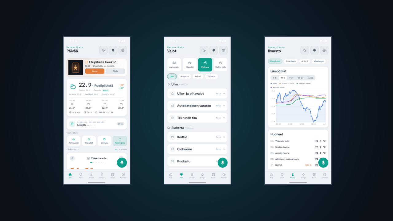
The look settled into what Claude and I kept calling “cool-slate night”: a dark, calm background, one signature teal that glows faintly like a status light, and a lot of breathing room. There’s a daylight version too, for when you’re outside squinting at your phone in the sun. A few deliberate rules give it character:
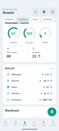
- Three typefaces, each with a job. One for headings, one for ordinary interface text, and — the detail I love — a monospace font used for every measured value. Every temperature, price, and kilowatt reading is set in that typewriter-style font, so numbers line up in neat columns and feel like instrument readouts rather than prose.
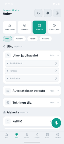
- No emoji. Every little symbol in the app is a proper icon from a single consistent set, not a colourful emoji borrowed from the phone. It’s a small discipline that does a lot of quiet work.
- Everything on a grid. Spacing comes in fixed steps, so nothing is ever “roughly aligned.” The tablet and the phone even use different spacing rules baked into the same kit — the wall display can afford to be roomier than something in your hand.
The icons had to be invented
A small saga worth telling, because it’s so typical of how this went. The design called for a specific, tasteful set of icons. On a web page those are one line to include. But this is a native app, and the equivalent icon set simply didn’t exist in the right form. Rather than compromise the look, Claude wrote a little script that took each icon’s underlying shape and regenerated it as native app code — conjuring the entire icon set into existence in the exact format the app needed. Roughly seventy hand-shaped glyphs, generated to match the design, because settling for “close enough” wasn’t on the table. I didn’t ask for that. Claude hit the wall, explained the problem, proposed the workaround, and did it.
The parts, and the one that breathes
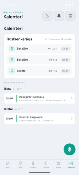
Out of all this came a library of about twenty-five reusable pieces — the card, the little stat tile, the gauge, the line chart, the electricity-price bars, the climate card, the announcement feed, the tablet’s side navigation. Assemble the seven screens out of those and everything automatically agrees with everything else.
My favourite is the voice control — the “dock” with the microphone. When the app is listening, the orb doesn’t just sit there; it breathes, a slow pulse of that signature teal, so you can tell across the room that the house is paying attention. The same gentle motion marks the live data dots. It’s the one place the design lets itself be a little alive, and it’s the thing everyone notices first.
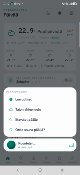
One kit, three shapes
Because the whole look is a kit of rules rather than a set of fixed screens, the same app can rearrange itself for wildly different situations without ever looking like a different app. On a phone you get a tab bar along the bottom. On the hallway tablet, turned landscape, it becomes a wall dashboard with side navigation — the same cards, laid out to be read from across the room. And in the kids’ mode almost everything melts away, leaving a friendly greeting and one enormous button to talk to the house.
That’s the real payoff of doing the boring, disciplined thing up front. Three screens as different as a pocket, a wall, and a six-year-old’s attention span — and all three unmistakably the same home.
In Part 3, the least polished and most honest part of the story: what it’s actually like to sit there for two days directing an AI to build all of this — the shorthand, the screenshots, the genuinely funny mistakes, and the moment a bathroom scale’s worth of sauna electricity told me something was very wrong.